In the realm of marketing, colour is important.
There are several brands where colour serves as the initial association. Brand and logo recognition is enhanced by 80% simply by adding colour. For instance, the colour purple is linked with Cadbury. While choosing brand colours for marketing purposes may seem easy, you should be careful in choosing the right colour. Take these effective colour psychology tips from our expert marketing perspective.
What does Color Psychology in Marketing Imply?
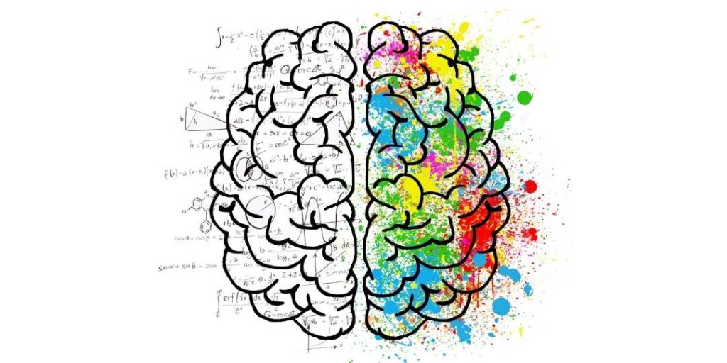
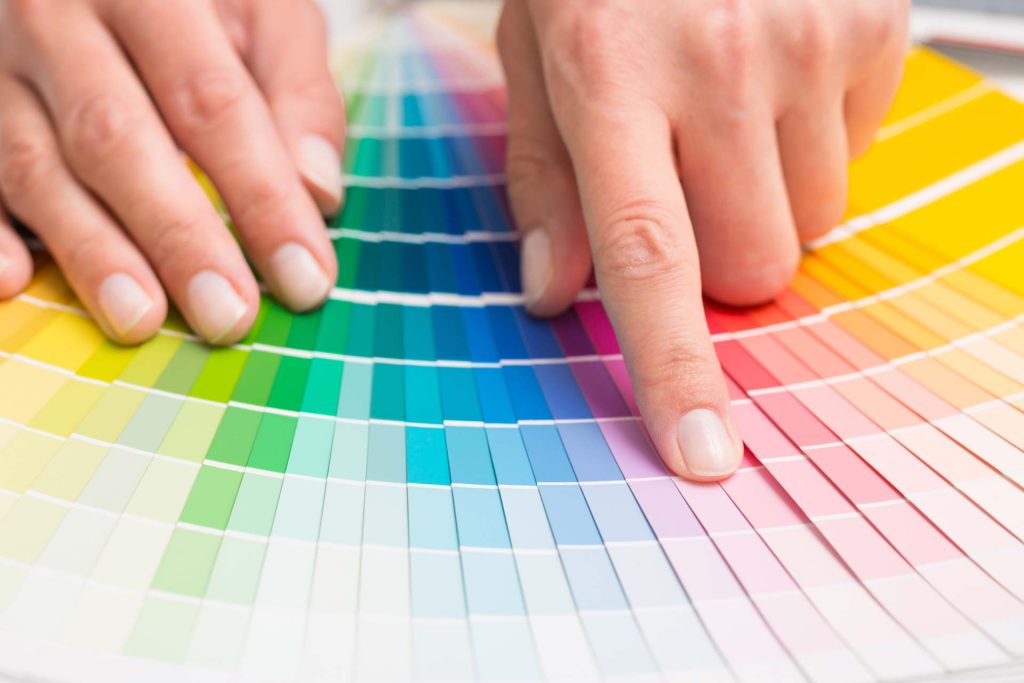
Studying how colour affects human behaviour and decision-making is known as color psychology. Different shades, tones, and hues evoke various associations. Depending on cultural and personal preferences, the psychology of colours can differ.
Choosing colours that align with your company’s objectives and target market is essential in marketing since they can affect how consumers perceive various brands and products.
Why does Color Psychology matter?
Depending on your chosen colour, you can stick out or fit in with the crowd. Your brand and reputation may suffer if you make a poor colour decision. Your audience may find your content or logo difficult to see or understand if you use the incorrect colours for them.
The correct colour for your business branding is crucial for the following reasons:
- Quick brand recognition
- Affects how people perceive your brand
- Consistent Look
- Leverage mood

Red Color Psychology
Red provokes strong emotions, boosts appetite, represents passion and love, and intensifies passion and intensity regarding personality and visual signals. Coles, Netflix and YouTube both make use of it.
Red – Bold
Yellow Color Psychology
The colour yellow stimulates thought, promotes communication, strains the eyes, and also makes people happier. It represents optimism, youth, and marketing clarity. It is used to catch window shoppers’ eyes.
Yellow – Positive
Blue Color Psychology
This colour is most frequently related to water and is favoured by men. It suppresses hunger and stands for tranquility and peace. Additionally, the colour is thought to foster loyalty. This Blue colour is used by Big W, Facebook, Ford, LinkedIn, and governments. Blue is undoubtedly one of the best colours for marketing.
Blue – Friendly
Orange Color Psychology
Orange-coloured brands are perceived as upbeat and assured. It has an aggressive connotation and is utilised in marketing to sway impulsive consumers. It produces a call-to-action strategy such as Subscribe options. The colour is used by Origin and Alinta Energy, and is linked to value and accessibility.
Orange – Mood Lifter
Green Color Psychology
The human eye can distinguish most colours of green. It symbolises new growth. It is employed in marketing to promote a comfortable atmosphere in stores. This colour is used by Woolworths, Spotify and BP.
Green – Focus
Purple Color Psychology
The most popular hue for luxury brand products perfectly combines the intensity and vigour of red with the steadiness of blue. Since it represents innovation, mystery, and regeneration, it is the colour most frequently employed in the creative sectors. Marketers must remember that too much purple invites distraction and introspection.
Purple – Royal
Black Color Psychology
Black is also a great colour as it subtly draws attention. It is a prominent and internationally recognised colour, and it’s best used when you want to create a sterile or institutionalised feeling in your store. The ABC, Australian Government and Adidas are among the brands that use black colour.
Black – Powerful
How to use the Psychology of Colours in Marketing?
Decide on your Brand’s Personality.
To attempt to convey the nature of your brand through colour, you must clearly understand that brand’s personality. Start by listing a few adverbs that best characterise your company. Concentrate on your main differentiators—the elements that make you stand out from the crowd.
Choose a Key Brand Color.
Considering your brand’s personality attributes, choose a key brand colour.
Knowing colour psychology, you can better grasp the psychological qualities people typically identify with popular colours. Warm colours are more associated with energy, enthusiasm, and positivity, whereas cool colours are more likely to create feelings of trust, loyalty, and stability.
Be Consistent with the Color.
Make sure the colour is consistent and present everywhere if your target market associates your brand with a specific shade. Because of this, maintaining colour harmony with your branding is crucial, and the most successful brands understand this.
Make a Brand Color Scheme.
You want to avoid becoming one-note in your marketing, but you also want to keep the colours consistent. Having a colour scheme to work with that allows for some variability but establishes certain guidelines is the solution.
Final Thoughts
Using colour psychology effectively can result in a satisfying user experience. To truly sparkle and delight users, a product must have this finishing touch, so talk to our team about marketing your brand using promotional products and apparel.
